Awaken Your Senses
Elevate your daily ritual with our curated coffee experiences

Awaken Your Senses
Elevate your daily ritual with our curated coffee experiences




The Roasters Pack
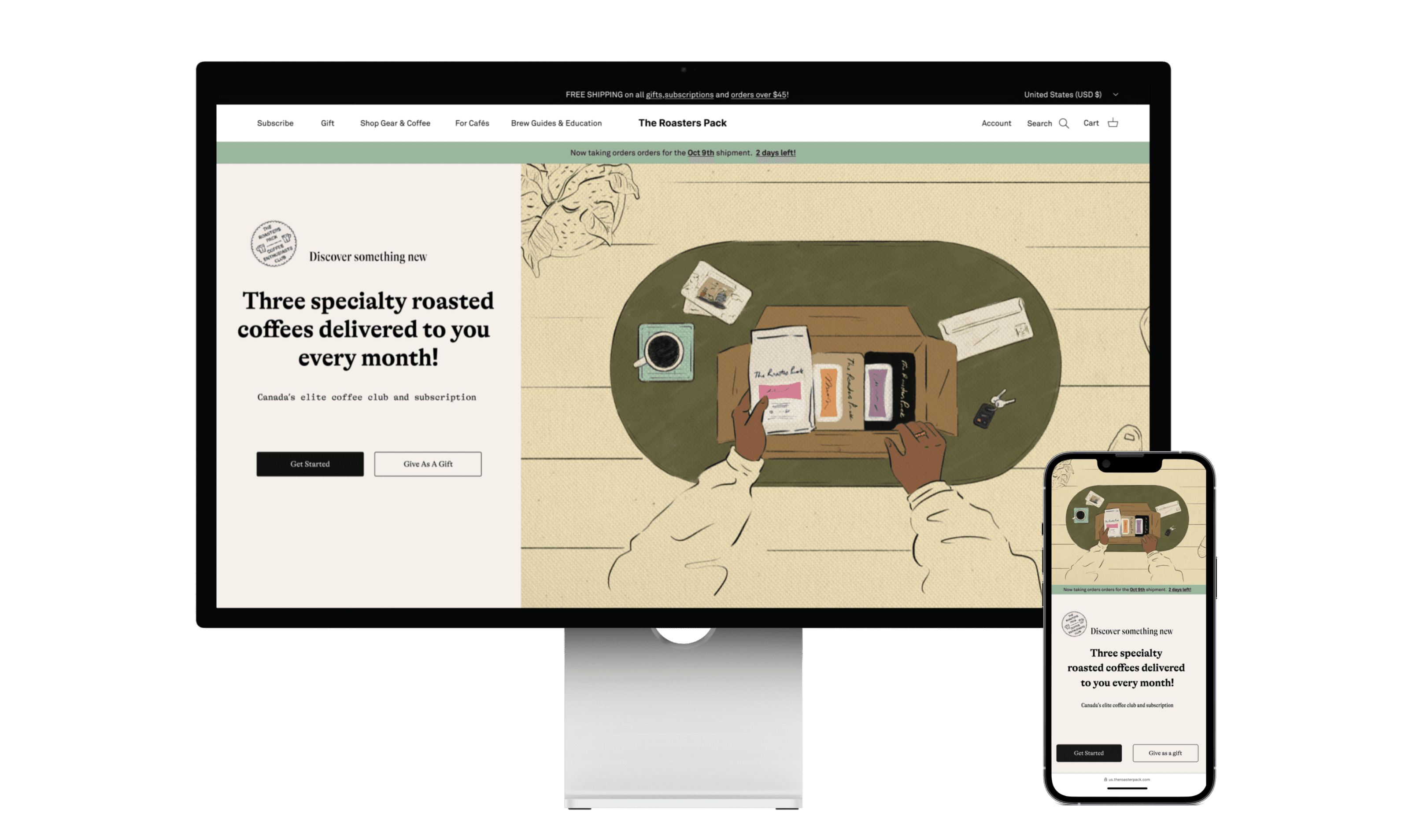
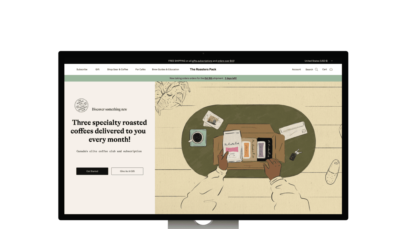
The Roasters Pack company is rebranding and launching a more in-depth version of their coffee subscription. They want the UI/UX team to redesign their onboarding quiz webpage with a prototype.
The Roasters Pack
The Roasters Pack company is rebranding and launching a more in-depth version of their coffee subscription. They want the UI/UX team to redesign their onboarding quiz webpage with a prototype.
The Roasters Pack
The Roasters Pack company is rebranding and launching a more in-depth version of their coffee subscription. They want the UI/UX team to redesign their onboarding quiz webpage with a prototype.
The Roasters Pack
The Roasters Pack company is rebranding and launching a more in-depth version of their coffee subscription. They want the UI/UX team to redesign their onboarding quiz webpage with a prototype.
The Roasters Pack
The Roasters Pack company is rebranding and launching a more in-depth version of their coffee subscription. They want the UI/UX team to redesign their onboarding quiz webpage with a prototype.
The Roasters Pack
The Roasters Pack company is rebranding and launching a more in-depth version of their coffee subscription. They want the UI/UX team to redesign their onboarding quiz webpage with a prototype.
The Roasters Pack
The Roasters Pack company is rebranding and launching a more in-depth version of their coffee subscription. They want the UI/UX team to redesign their onboarding quiz webpage with a prototype.
The Roasters Pack
The Roasters Pack company is rebranding and launching a more in-depth version of their coffee subscription. They want the UI/UX team to redesign their onboarding quiz webpage with a prototype.
The Roasters Pack
The Roasters Pack company is rebranding and launching a more in-depth version of their coffee subscription. They want the UI/UX team to redesign their onboarding quiz webpage with a prototype.
The Roasters Pack
The Roasters Pack company is rebranding and launching a more in-depth version of their coffee subscription. They want the UI/UX team to redesign their onboarding quiz webpage with a prototype.
The Roasters Pack
The Roasters Pack company is rebranding and launching a more in-depth version of their coffee subscription. They want the UI/UX team to redesign their onboarding quiz webpage with a prototype.
The Roasters Pack
The Roasters Pack company is rebranding and launching a more in-depth version of their coffee subscription. They want the UI/UX team to redesign their onboarding quiz webpage with a prototype.
The Roasters Pack
The Roasters Pack company is rebranding and launching a more in-depth version of their coffee subscription. They want the UI/UX team to redesign their onboarding quiz webpage with a prototype.
Project Duration
6 weeks (Oct 2023)
Tools

Product
Coffee Subscriptions
Project Duration
6 weeks (Oct 2023)
Tools

Product
Coffee Subscriptions
Project Duration
6 weeks (Oct 2023)
Tools

Product
Coffee Subscriptions
Project Duration
6 weeks (Oct 2023)
Tools

Product
Coffee Subscriptions
Project Duration
6 weeks (Oct 2023)
Tools

Product
Coffee Subscriptions
Project Duration
6 weeks (Oct 2023)
Tools

Product
Coffee Subscriptions
Project Duration
6 weeks (Oct 2023)
Tools

Product
Coffee Subscriptions
Project Duration
6 weeks (Oct 2023)
Tools

Product
Coffee Subscriptions
Project Duration
6 weeks (Oct 2023)
Tools

Product
Coffee Subscriptions
Project Duration
6 weeks (Oct 2023)
Tools

Product
Coffee Subscriptions
Project Duration
6 weeks (Oct 2023)
Tools

Product
Coffee Subscriptions
Project Duration
6 weeks (Oct 2023)
Tools

Product
Coffee Subscriptions
Project Duration
6 weeks (Oct 2023)
Tools

Product
Coffee Subscriptions
Team Members
3
My Role
Product Designer
Device
Desktop/Mobile
Team Members
3
My Role
Product Designer
Device
Desktop/Mobile
Team Members
3
My Role
Product Designer
Device
Desktop/Mobile
Team Members
3
My Role
Product Designer
Device
Desktop/Mobile
Team Members
3
My Role
Product Designer
Device
Desktop/Mobile
Team Members
3
My Role
Product Designer
Device
Desktop/Mobile
Team Members
3
My Role
Product Designer
Device
Desktop/Mobile
Team Members
3
My Role
Product Designer
Device
Desktop/Mobile
Team Members
3
My Role
Product Designer
Device
Desktop/Mobile
Team Members
3
My Role
Product Designer
Device
Desktop/Mobile
Team Members
3
My Role
Product Designer
Device
Desktop/Mobile
Team Members
3
My Role
Product Designer
Device
Desktop/Mobile
Team Members
3
My Role
Product Designer
Device
Desktop/Mobile
The Roasters Pack
The Roasters Pack company is rebranding and launching a more in-depth version of their coffee subscription. They want the UI/UX team to redesign their onboarding quiz webpage with a prototype.
Timeline
6 weeks
Tools

Product
Coffee Plan
Team
3
My Role
Product Designer
Device
Desktop/Mobile
What Problems?
Challenges - Constraints website design
Their website is built on Shopify, which limits their ability to develop highly unique webpage functionality and styles.
Challenges - Constraints website design
Their website is built on Shopify, which limits their ability to develop highly unique webpage functionality and styles.
Challenges - Constraints website design
Their website is built on Shopify, which limits their ability to develop highly unique webpage functionality and styles.
Challenges - Constraints website design
Their website is built on Shopify, which limits their ability to develop highly unique webpage functionality and styles.
Challenges - Constraints website design
Their website is built on Shopify, which limits their ability to develop highly unique webpage functionality and styles.
Challenges - Constraints website design
Their website is built on Shopify, which limits their ability to develop highly unique webpage functionality and styles.
Challenges - Constraints website design
Their website is built on Shopify, which limits their ability to develop highly unique webpage functionality and styles.
Challenges - Constraints website design
Their website is built on Shopify, which limits their ability to develop highly unique webpage functionality and styles.
Challenges - Constraints website design
Their website is built on Shopify, which limits their ability to develop highly unique webpage functionality and styles.
Challenges - Constraints website design
Their website is built on Shopify, which limits their ability to develop highly unique webpage functionality and styles.
Challenges - Constraints website design
Their website is built on Shopify, which limits their ability to develop highly unique webpage functionality and styles.
Challenges - Constraints website design
Their website is built on Shopify, which limits their ability to develop highly unique webpage functionality and styles.
Challenges - Constraints website design
Their website is built on Shopify, which limits their ability to develop highly unique webpage functionality and styles.
Challenges - High drop off
The drop-off rate on the subscription page is very high, and it seems that they cannot successfully convert potential users through the onboarding quiz.
Challenges - High drop off
The drop-off rate on the subscription page is very high, and it seems that they cannot successfully convert potential users through the onboarding quiz.
Challenges - High drop off
The drop-off rate on the subscription page is very high, and it seems that they cannot successfully convert potential users through the onboarding quiz.
Challenges - High drop off
The drop-off rate on the subscription page is very high, and it seems that they cannot successfully convert potential users through the onboarding quiz.
Challenges - High drop off
The drop-off rate on the subscription page is very high, and it seems that they cannot successfully convert potential users through the onboarding quiz.
Challenges - High drop off
The drop-off rate on the subscription page is very high, and it seems that they cannot successfully convert potential users through the onboarding quiz.
Challenges - High drop off
The drop-off rate on the subscription page is very high, and it seems that they cannot successfully convert potential users through the onboarding quiz.
Challenges - High drop off
The drop-off rate on the subscription page is very high, and it seems that they cannot successfully convert potential users through the onboarding quiz.
Challenges - High drop off
The drop-off rate on the subscription page is very high, and it seems that they cannot successfully convert potential users through the onboarding quiz.
Challenges - High drop off
The drop-off rate on the subscription page is very high, and it seems that they cannot successfully convert potential users through the onboarding quiz.
Challenges - High drop off
The drop-off rate on the subscription page is very high, and it seems that they cannot successfully convert potential users through the onboarding quiz.
Challenges - High drop off
The drop-off rate on the subscription page is very high, and it seems that they cannot successfully convert potential users through the onboarding quiz.
Challenges - High drop off
The drop-off rate on the subscription page is very high, and it seems that they cannot successfully convert potential users through the onboarding quiz.
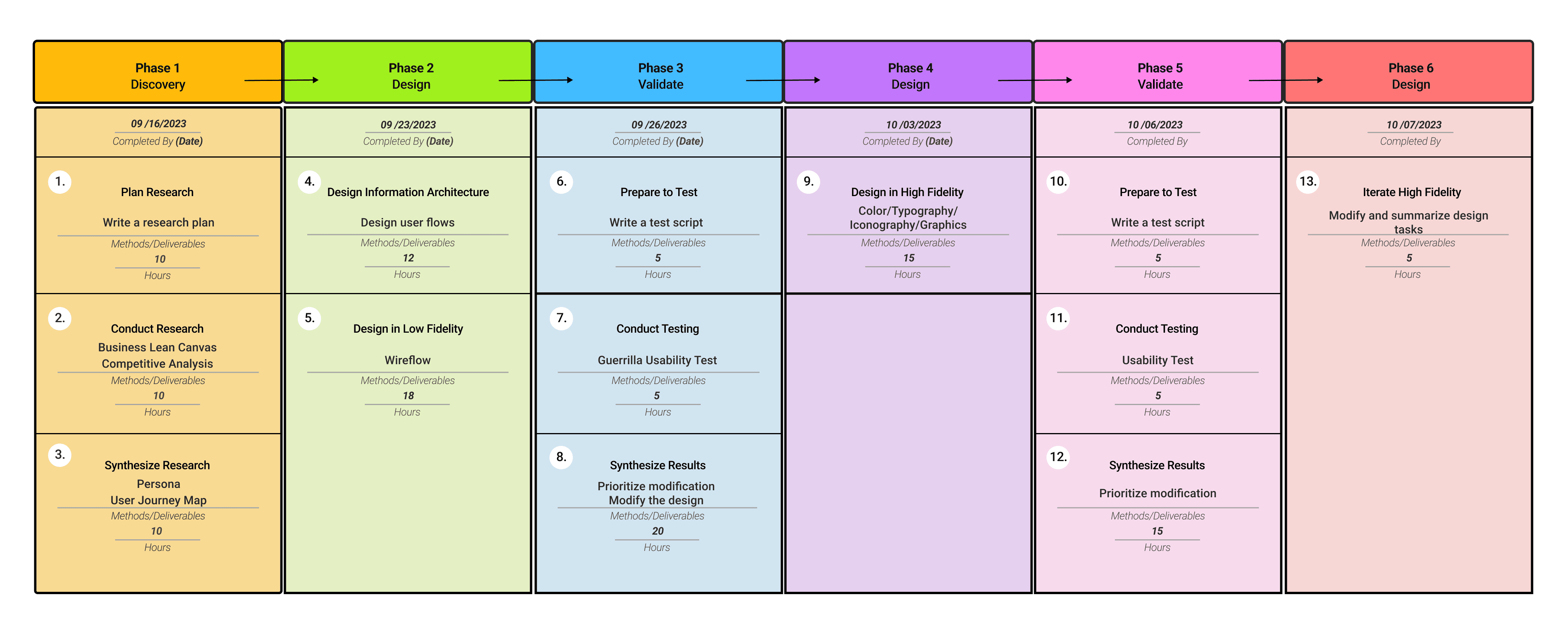
What We Do?
A project plan ensures that all team members work in sync according to the schedule. Furthermore, our client will also be aware of what tasks we are undertaking at different stages, allowing them to provide targeted suggestions and raise specific questions.
What Problems?
Challenges - Constraints website design
Their website is built on Shopify, which limits their ability to develop highly unique webpage functionality and styles.
Challenges - High drop off
The drop-off rate on the subscription page is very high, and it seems that they cannot successfully convert potential users through the onboarding quiz.
What We Do?
A project plan ensures that all team members work in sync according to the schedule. Furthermore, our client will also be aware of what tasks we are undertaking at different stages, allowing them to provide targeted suggestions and raise specific questions.
User Experience and Product Research
In order to identify the root cause of the issue and determine the direction of the design, we have ultimately decided to conduct three types of analysis related to our product and user base:
User Experience and Product Research
In order to identify the root cause of the issue and determine the direction of the design, we have ultimately decided to conduct three types of analysis related to our product and user base:
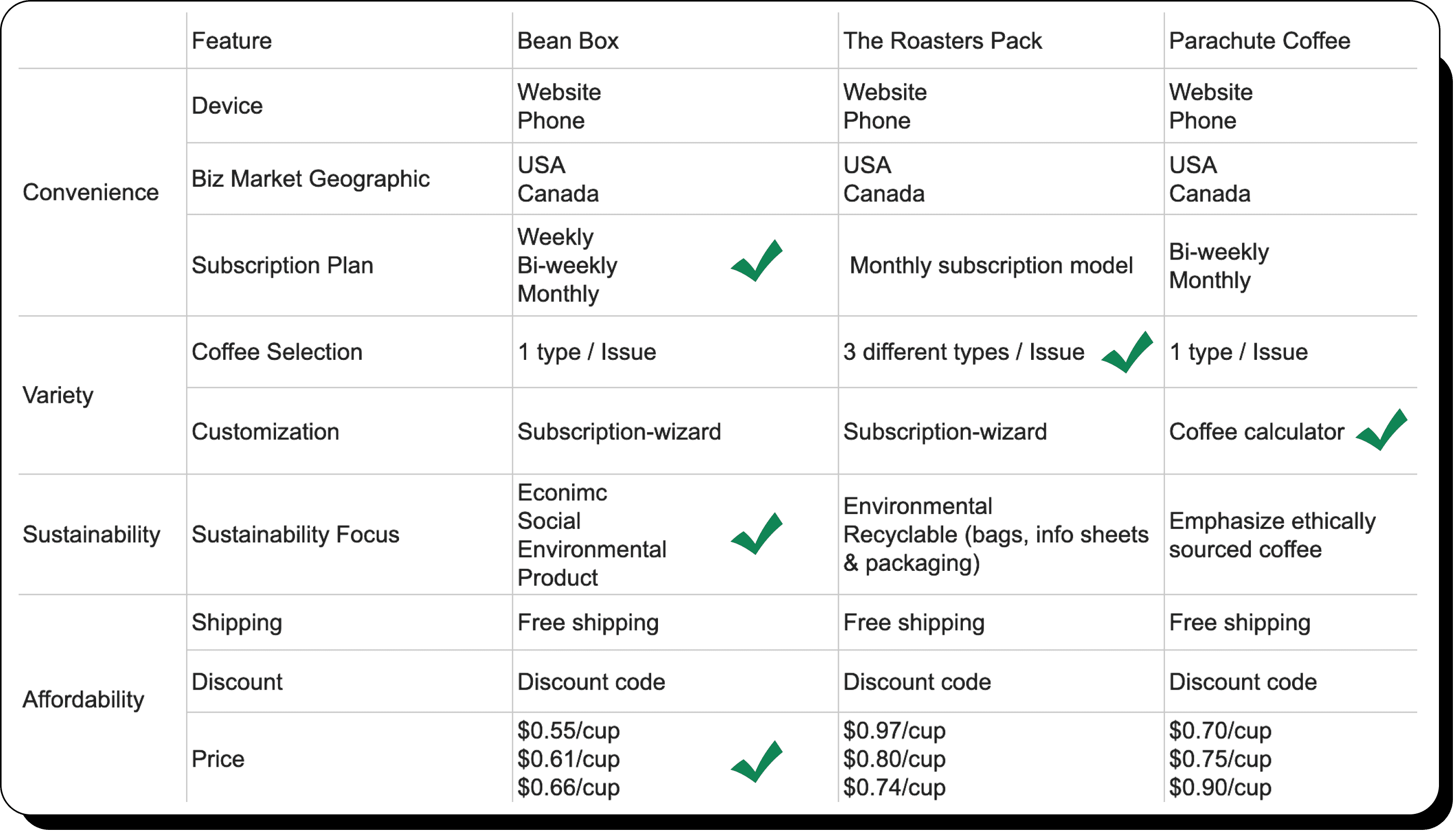
This will assist us in quickly gaining insights into the coffee subscription service market and summarizing the unique features of subscription services.
This will assist us in quickly gaining insights into the coffee subscription service market and summarizing the unique features of subscription services.
Desk Research
Desk Research
Finding - Users care about
Convenience / Variety / Affordability / Sustainability
Finding - Users care about
Convenience / Variety / Affordability / Sustainability
Finding - Product Segmentation
Coffee Type / Roast Type / Frind Type / Shipment Choice / Place Of Production
Finding - Product Segmentation
Coffee Type / Roast Type / Frind Type / Shipment Choice / Place Of Production
This analysis will help us identify issues in web design and discover design patterns that can attract and retain users.
This analysis will help us identify issues in web design and discover design patterns that can attract and retain users.
qualitative research
qualitative research


Dan
Student
Dan
Student
Says
I need coffee to help me study, but I don't want it to be too expensive
Feels
I feel conflicted because good-quality coffee is expensive, and cheap coffee tends to be of lower quality
Thinks
I won't order coffee from online pages that don't look aesthetically pleasing because they don't seem reliable
Does
I prefer to find a coffee subscription from a well-designed website


May
Writer
Says
I wake up early every day for work, and coffee helps me stay alert
Feels
I'm not very knowledgeable about coffee, so sometimes I receive products that don't meet my expectations
Thinks
I need a straightforward subscription process to help me accurately find coffee products that suit my preferences
Does
I will use a matching process for coffee products to ensure that what I purchase is right for me


Julie
Biz Owner
Says
I have my own studio, and I subscribe to coffee for my employees
Feels
Sometimes, I find it challenging to determine how much coffee I need to subscribe to for my employees each month
Thinks
I need enough information and a simple, understandable process to help me figure out the quantity of coffee I need each month
Does
I wait for my employees to tell me when we're running out of coffee before placing an order

Mary
Writer
Says
I wake up early every day for work, and coffee helps me stay alert
Feels
I'm not very knowledgeable about coffee, so sometimes I receive products that don't meet my expectations
Thinks
I need a straightforward subscription process to help me accurately find coffee products that suit my preferences
Does
I will use a matching process for coffee products to ensure that what I purchase is right for me

Julie
Biz Owner
Says
I have my own studio, and I subscribe to coffee for my employees
Feels
Sometimes, I find it challenging to determine how much coffee I need to subscribe to for my employees each month
Thinks
I need enough information and a simple, understandable process to help me figure out the quantity of coffee I need each month
Does
I wait for my employees to tell me when we're running out of coffee before placing an order
This will assist us in quickly gaining insights into the coffee subscription service market and summarizing the unique features of subscription services.
This will assist us in quickly gaining insights into the coffee subscription service market and summarizing the unique features of subscription services.
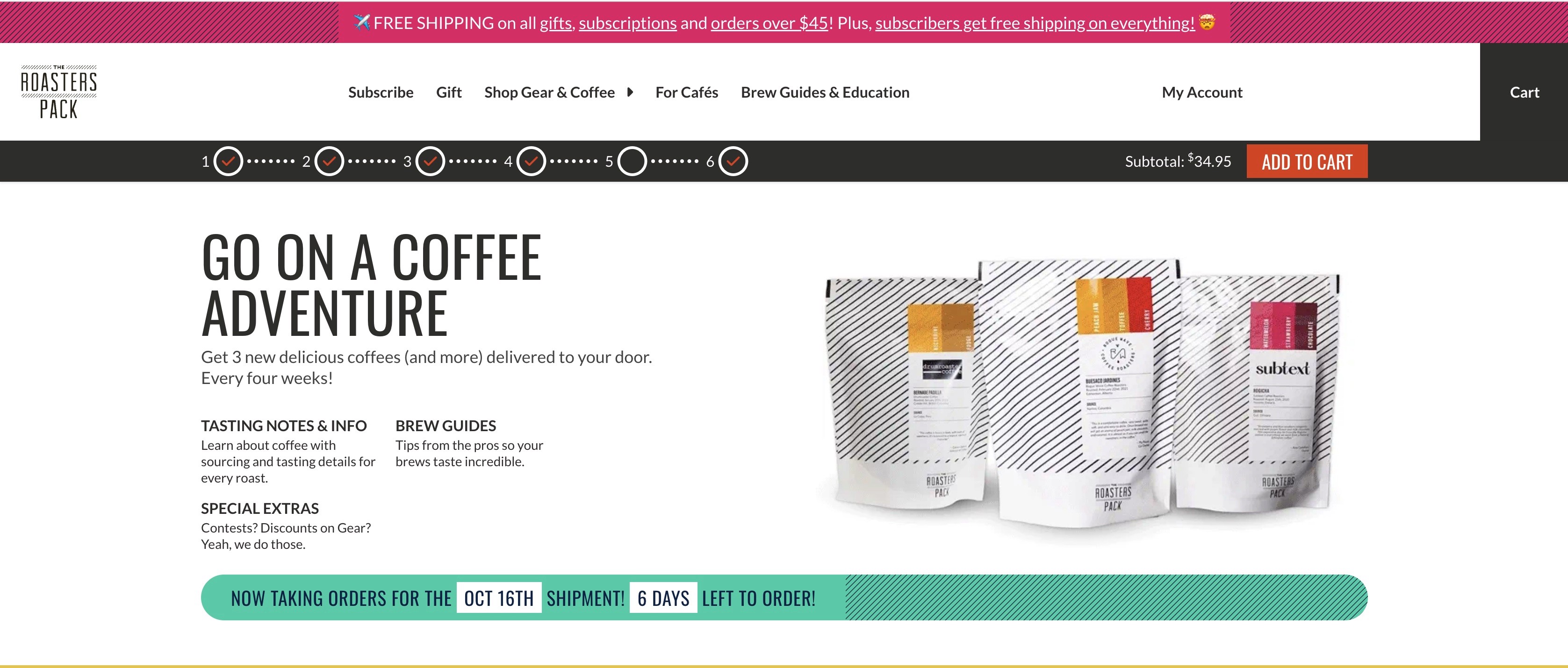
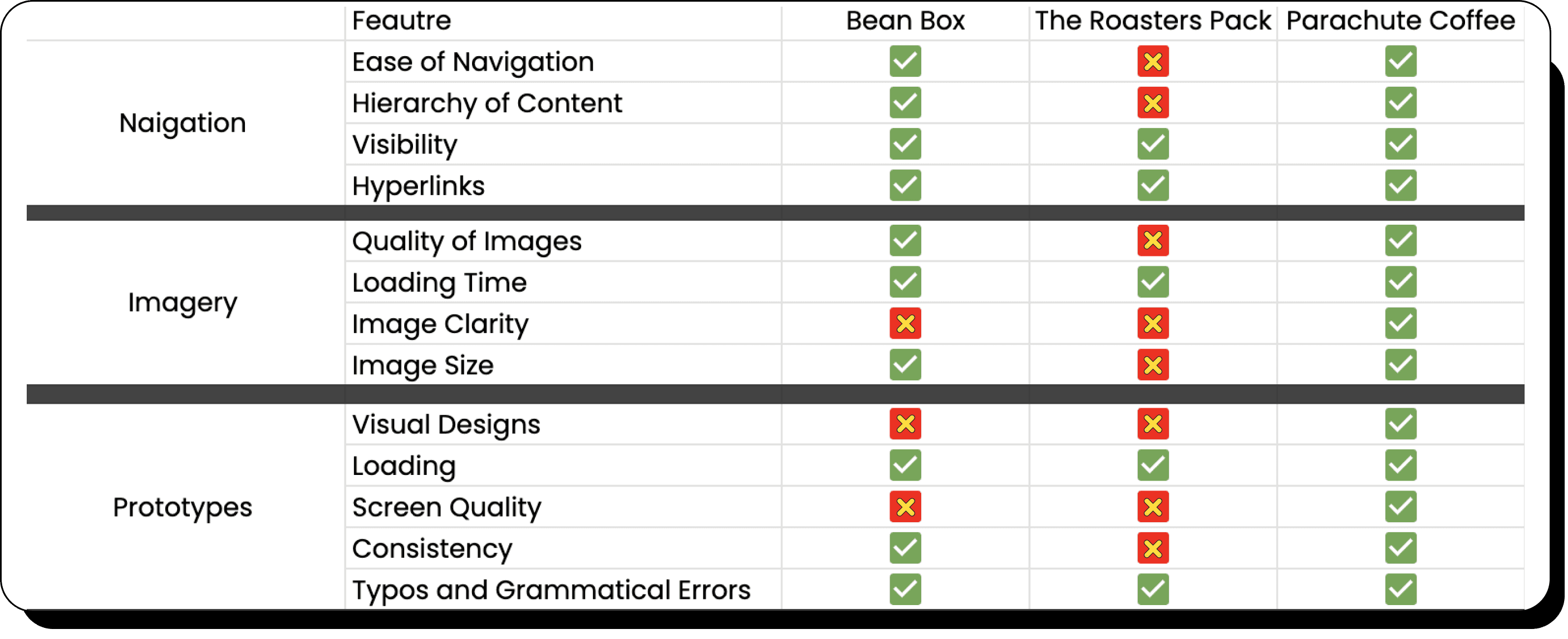
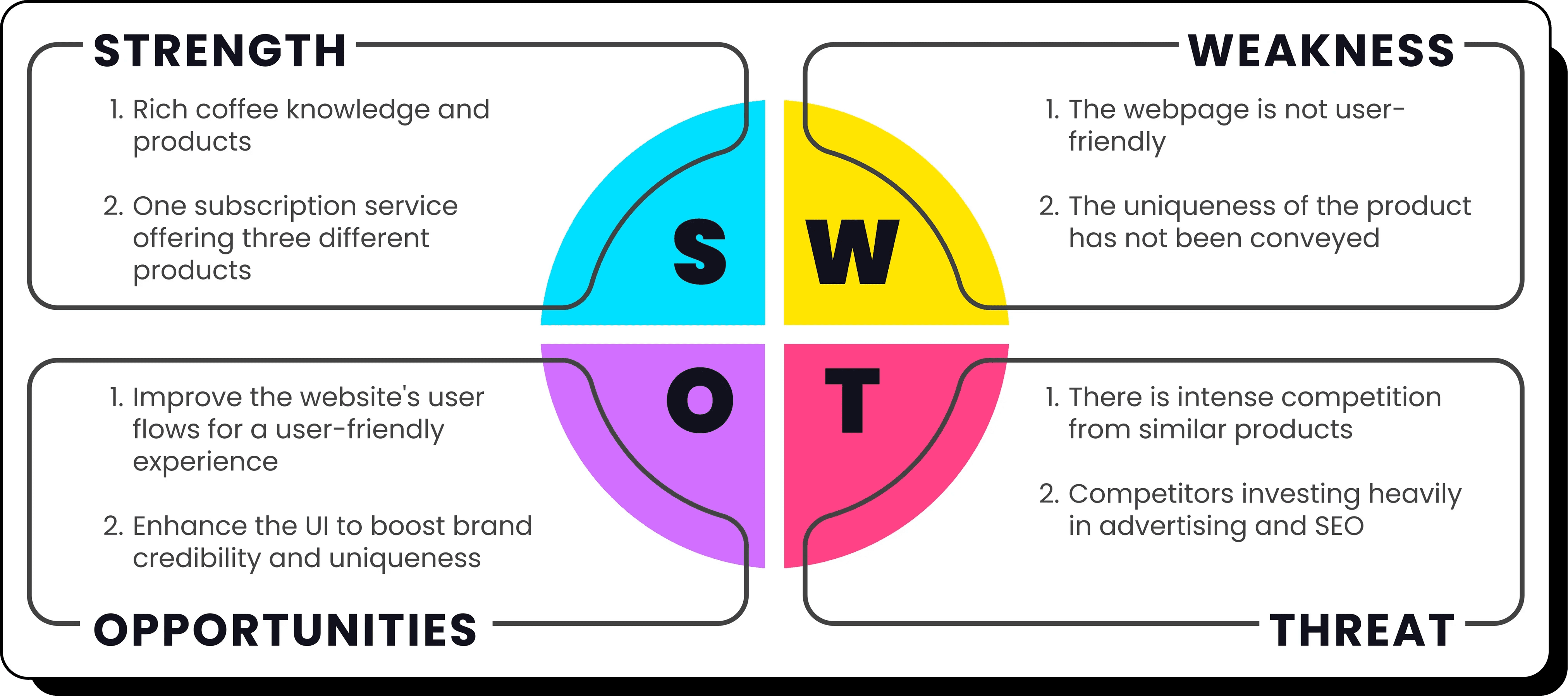
Competitive Analysis
Competitive Analysis





Solutions
Solutions
Focus on branding and consistency
Even with Shopify's limitations, we can still customize the visual elements within the platform to make The Roasters Pack's website visually appealing and unique.
Focus on branding and consistency
Even with Shopify's limitations, we can still customize the visual elements within the platform to make The Roasters Pack's website visually appealing and unique.
Create a short and engaging onboarding quiz
Longer questions tend to lead to more drop-offs, so a quick and enjoyable questionnaire can reduce drop-off rates. We'll test this hypothesis in usability testing.
Short & engaging onboarding quiz
Longer questions tend to lead to more drop-offs, so a quick and enjoyable questionnaire can reduce drop-off rates. We'll test this hypothesis in usability testing.
Pricing Strategies
Implement pricing strategies to boost the purchase desire for products with less apparent price advantages through redesign, reducing drop-offs caused by price sensitivity.
Pricing Strategies
Implement pricing strategies to boost the purchase desire for products with less apparent price advantages through redesign, reducing drop-offs caused by price sensitivity.
Click - Zoom In

Tap - Zoom In



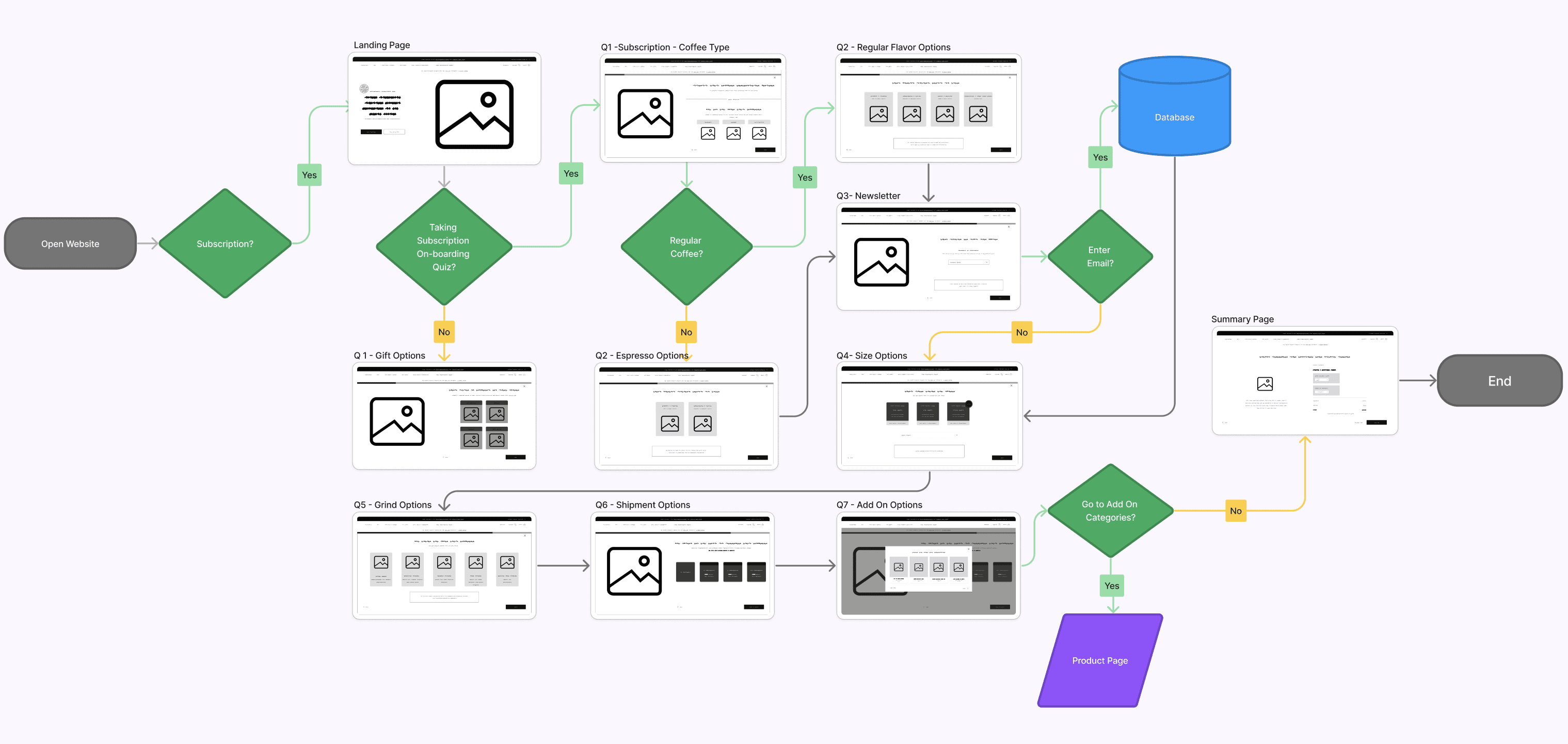
We obtained the onboarding quiz questions from the client. After multiple meetings and collaborations with our client, we finalized the redesigned version of User Flows.
This new User Flow serves the following purposes:
We obtained the onboarding quiz questions from the client. After multiple meetings and collaborations with our client, we finalized the redesigned version of User Flows.
This new User Flow serves the following purposes:
WireFlow
WireFlow
Traceable data layout
Traceable data layout
Cost-effective frontend code development
Cost-effective frontend code development
Simple and understandable workflow
Simple and understandable workflow
Accurate user preferences and product recommendations
Accurate user preferences and product recommendations
Streamlined quiz process
Streamlined quiz process

Our Client
" Before you design the wireframes, I have some design ideas. "
" Before you design the wireframes, I have some design ideas. "
Graphical variant options format
Graphical variant options format
Providing sufficient space for text editing
Providing sufficient space for text editing
A drop-down menu is a must (web development constraints)
A drop-down menu is a must (web development constraints)

April
April
As a coffee lover, I want to subscribe to an affordable monthly specialty coffee package plan so I can enjoy coffee at home.
As a coffee lover, I want to subscribe to an affordable monthly specialty coffee package plan so I can enjoy coffee at home.
User Story
User Story
Legend
Legend
Click - Zoom In
Tap - Zoom In



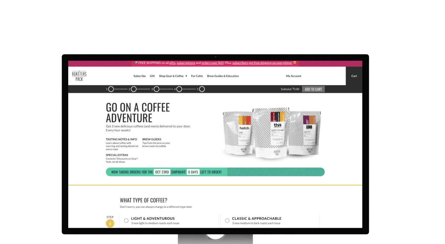


Before
After
Landing page:
Complex navigation bar
Muddled landing page themes
Heighten reading distractions with excess information
Jumbled color blocks disrupt reading flow
Unbalanced text-to-image ratio
Landing page:
Complex navigation bar
Muddled landing page themes
Heighten reading distractions with excess information
Jumbled color blocks disrupt reading flow
Unbalanced text-to-image ratio
Landing page:
Complex navigation bar
Muddled landing page themes
Heighten reading distractions with excess information
Jumbled color blocks disrupt reading flow
Unbalanced text-to-image ratio
Improvements:
Streamlined navigation bar
Crisp landing page themes
Minimize distractions from excess info
Employ sizable color blocks for readability
Balance text-to-image ratio for better engagement
Improvements:
Streamlined navigation bar
Crisp landing page themes
Minimize distractions from excess info
Employ sizable color blocks for readability
Balance text-to-image ratio for better engagement
Improvements:
Streamlined navigation bar
Crisp landing page themes
Minimize distractions from excess info
Employ sizable color blocks for readability
Balance text-to-image ratio for better engagement

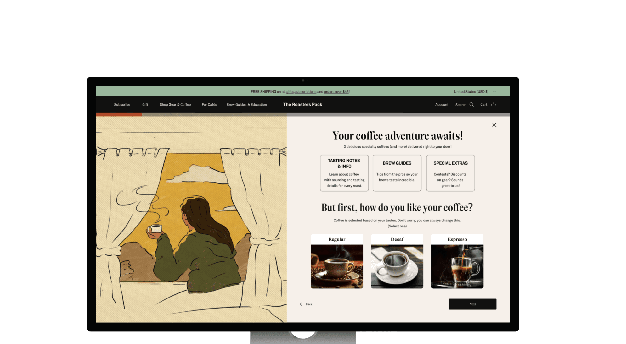

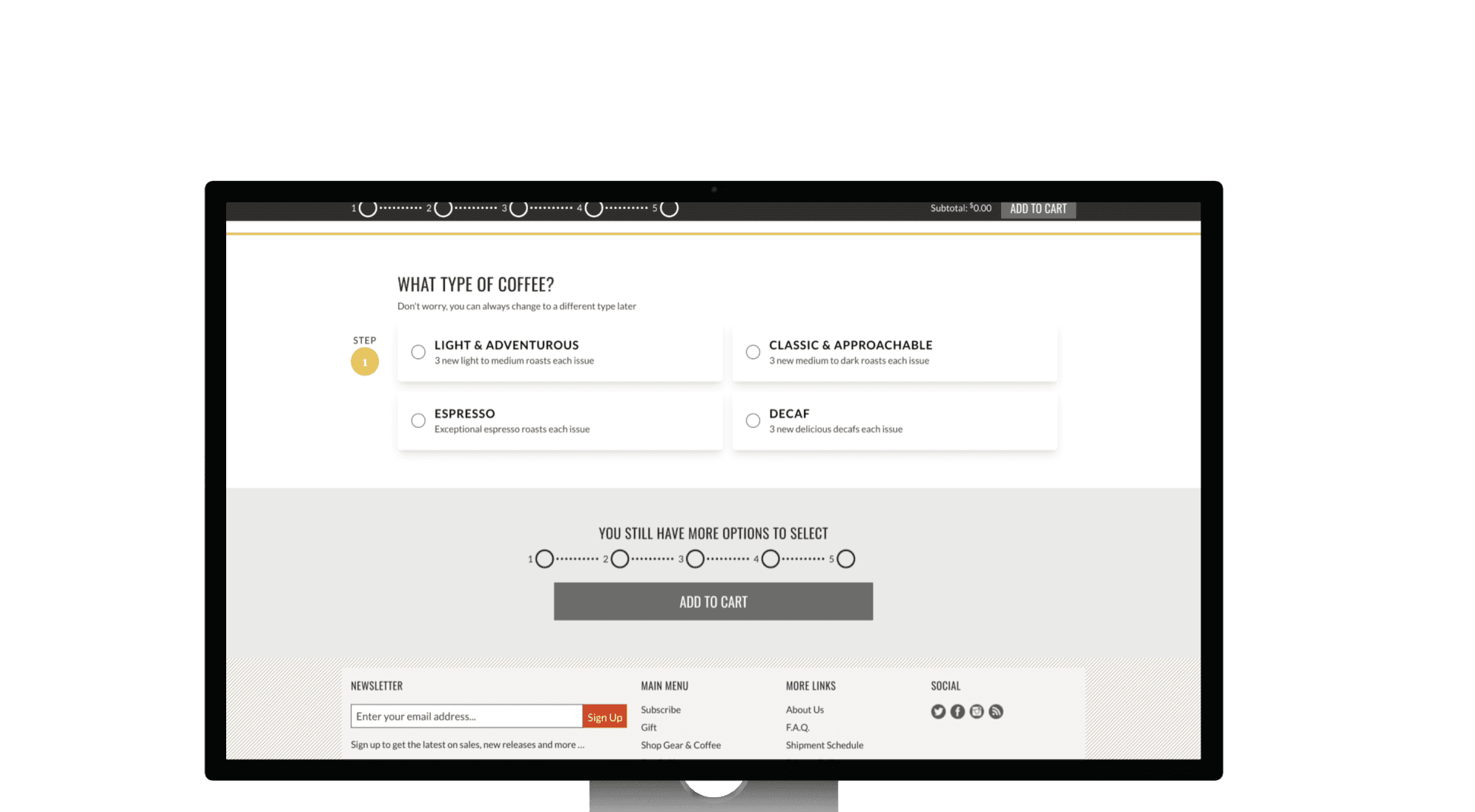
Before
After
Q&A Pages:
1. Text-only display, no images
Inconsistent design style
Keep redundant progress bar
Exclude unnecessary shadows
Change the primary button design for a distinct call to action
Improvements:
Enhance info presentation with images
Unify text, color, and layout style
Cut redundant elements like progress bars
Omit unnecessary shadows
Establish uniform primary button design

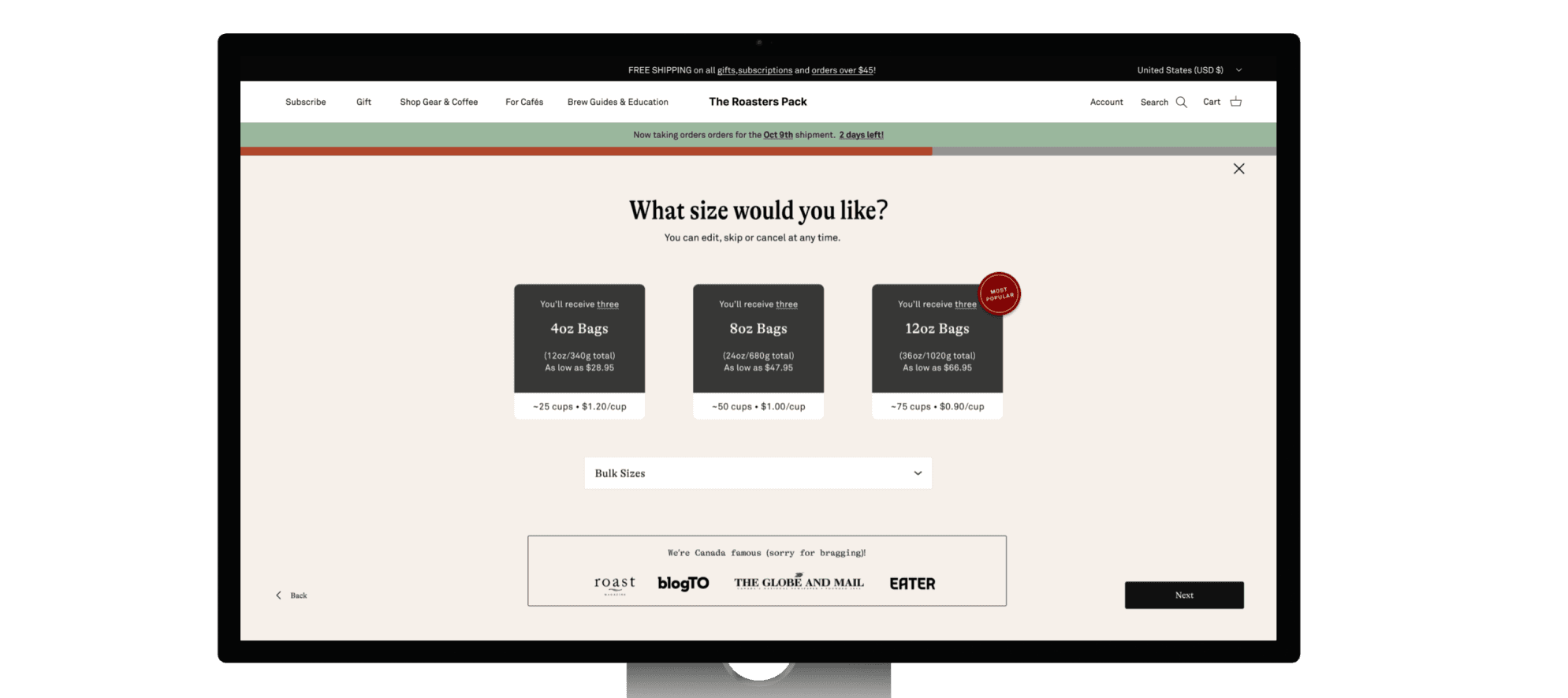

Before
After
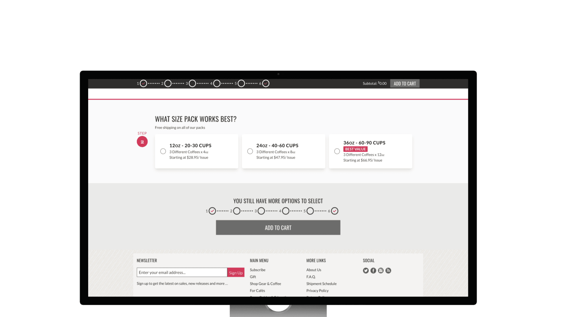
Product info Page:
1. Dull and overwhelming content
Unappealing pricing details
Lackluster use of current moment bias
Insufficient unconventional choices for specific users
Improvements:
Sleek options with streamlined info
Use the bandwagon effect to reduce price sensitivity (e.g. $/cup)
Apply current moment bias to hasten decision-making (e.g. Best Value)
Expand dropdown menu for unique


Before
After
Q&A Pages:
1. Text-only display, no images
Inconsistent design style
Keep redundant progress bar
Exclude unnecessary shadows
Change the primary button design for a distinct call to action
Improvements:
Enhance info presentation with images
Unify text, color, and layout style
Cut redundant elements like progress bars
Omit unnecessary shadows
Establish uniform primary button design


Before
After
Product info Page:
1. Dull and overwhelming content
Unappealing pricing details
Lackluster use of current moment bias
Insufficient unconventional choices for specific users
Improvements:
Sleek options with streamlined info
Use the bandwagon effect to reduce price sensitivity (e.g. $/cup)
Apply current moment bias to hasten decision-making (e.g. Best Value)
Expand dropdown menu for unique choices


Q&A Pages:
1. Text-only display, no images
Inconsistent design style
Keep redundant progress bar
Exclude unnecessary shadows
Change the primary button design for a distinct call to action
Improvements:
Enhance info presentation with images
Unify text, color, and layout style
Cut redundant elements like progress bars
Omit unnecessary shadows
Establish uniform primary button design
Before
After


Product info Page:
1. Dull and overwhelming content
Unappealing pricing details
Lackluster use of current moment bias
Insufficient unconventional choices for specific users
Improvements:
Sleek options with streamlined info
Use the bandwagon effect to reduce price sensitivity (e.g. $/cup)
Apply current moment bias to hasten decision-making (e.g. Best Value)
Expand dropdown menu for unique choices
Before
After
We made a total of three rounds of modifications to the high-fidelity screens and arrived at the final version (design without usability testing). The high-fidelity screens incorporate the solutions we mentioned earlier. Here are a few examples.
We made a total of three rounds of modifications to the high-fidelity screens and arrived at the final version (design without usability testing). The high-fidelity screens incorporate the solutions we mentioned earlier. Here are a few examples.
High Fidelity Screens
High Fidelity Screens


+32.7 %
+32.7 %
-6.3 Sec
-6.3 Sec
To test whether the redesigned screens perform better, we conducted 6 usability tests to assess the performance of the original design versus the new design.
To test whether the redesigned screens perform better, we conducted 6 usability tests to assess the performance of the original design versus the new design.
Usability Test
Usability Test
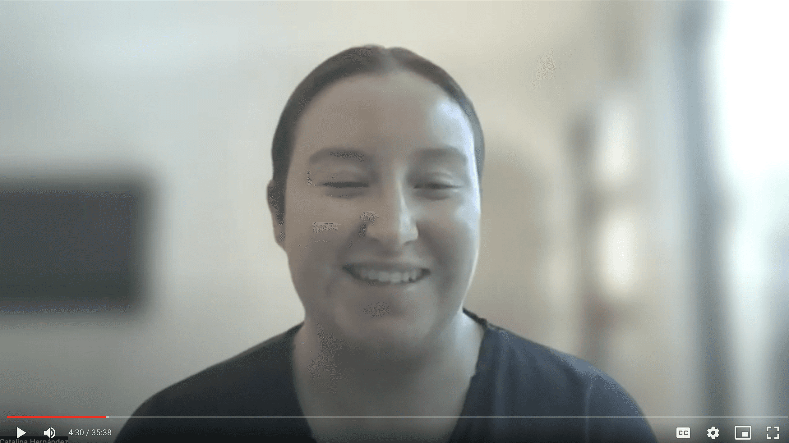


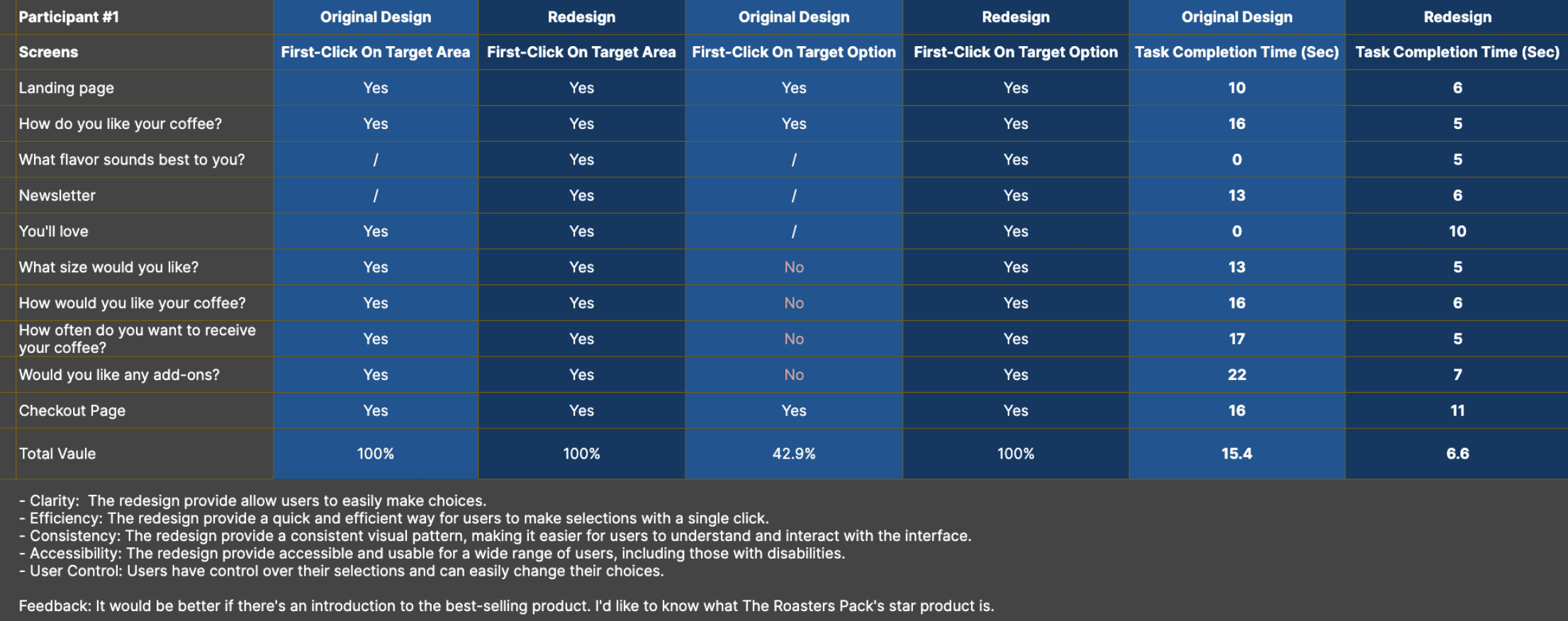
We use the First Click Test to assess whether our design improves user efficiency.
We use the First Click Test to assess whether our design improves user efficiency.
Metrics - First Click Test:
Metrics - First Click Test:
Result - The Success Rate
We compared the original version with the redesign in our testing. In the end, the results showed that the redesign improved the first-click success rate by an average of 32.7%.
Result - The Success Rate
We compared the original version with the redesign in our testing. In the end, the results showed that the redesign improved the first-click success rate by an average of 32.7%.
Result - The completion time
The redesign also reduced the time to complete each question by an average of 6.3 seconds compared to the original version.
Result - The completion time
The redesign also reduced the time to complete each question by an average of 6.3 seconds compared to the original version.
Click - Zoom In
Tap - Zoom In

Based on user and client feedback, we've added a summary to the ‘Quiz Result’ page. We also designed a mobile version to make products accessible to a broader audience that prefers using mobile.
Based on user and client feedback, we've added a summary to the ‘Quiz Result’ page. We also designed a mobile version to make products accessible to a broader audience that prefers using mobile.
Modification:
Modification:
Check Prototype
Check Prototype
Check Prototype
Check Prototype
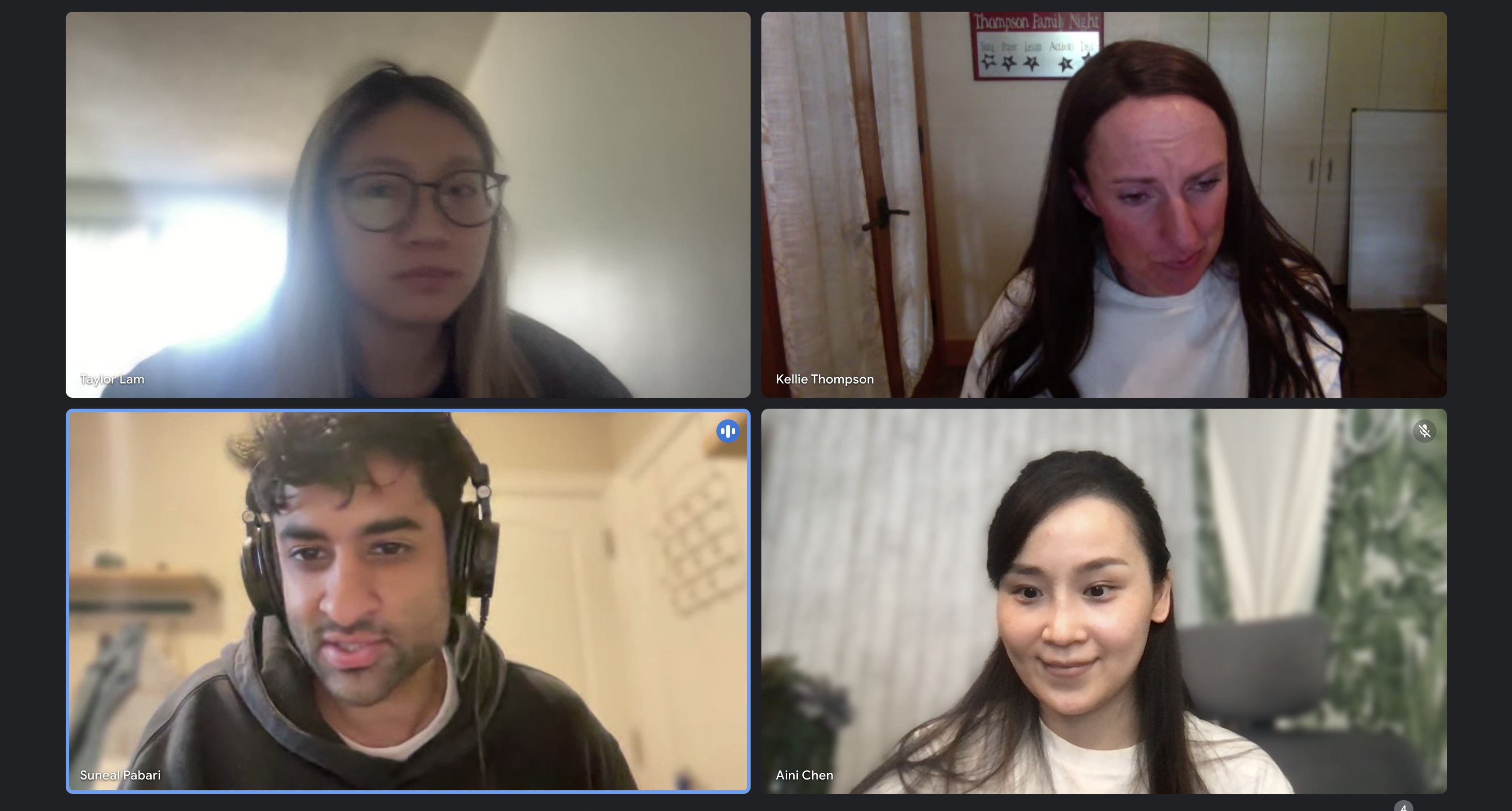
Meet the wonderful team members
Meet the wonderful team members

Striking a balance between user needs and design style must take into account the constraints of resources. Understanding web development capabilities before the design phase can help achieve this equilibrium for the entire project.
Striking a balance between user needs and design style must take into account the constraints of resources. Understanding web development capabilities before the design phase can help achieve this equilibrium for the entire project.
Key Takeaway 1:
Key Takeaway 1:
Everyone tends to have their own 'language' when describing their designs. When there's uncertainty in communication regarding the specifications of design elements, utilizing the language of CSS can resolve issues related to expressing various units.
Everyone tends to have their own 'language' when describing their designs. When there's uncertainty in communication regarding the specifications of design elements, utilizing the language of CSS can resolve issues related to expressing various units.
Key Takeaway 2:
Key Takeaway 2:
